Cassie Porter
Web Cartography Portfolio at the University of Kentucky
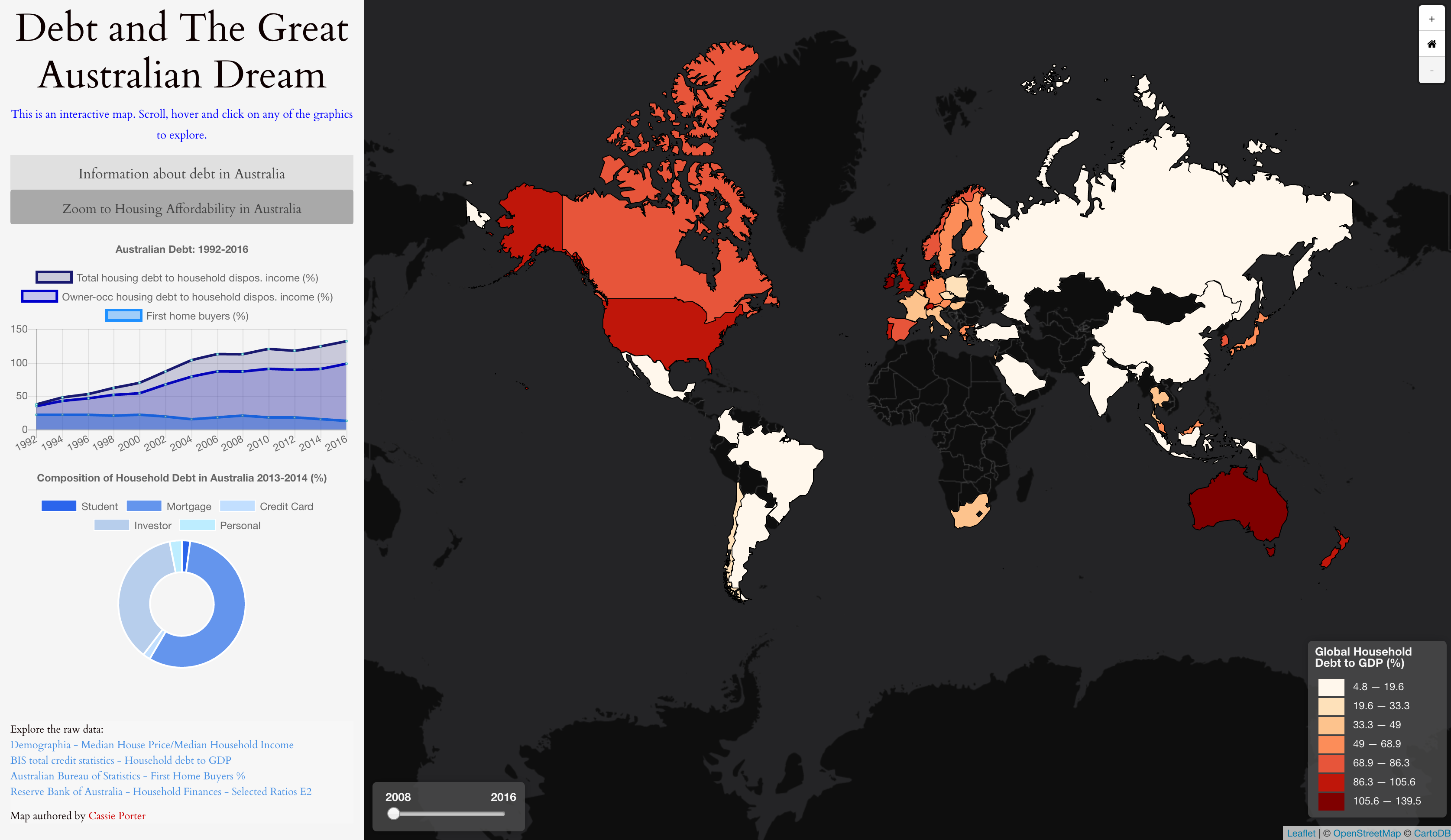
This map shows a comparison of worldwide debt and debt within Australia.
This map was built with custom JavaScript code, drawing upon the Leaflet JavaScript Library, Assembly CSS, Ajax, Chart js and Leaflet-omnivore.
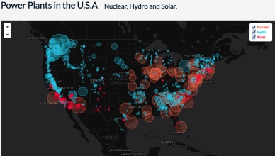
This map shows the relative proportion of nuclear, hydro and solar powered plants in the U.S.A
This map was built with custom JavaScript code, drawing upon the Leaflet JavaScript Library and referencing a geoJson file to produce a proportional symbol map with layers that are able to be toggled on or off. The map has on click features coded in to limit the data displayed to 500km from the clicked location. Popup information is also displayed for each plant when clicked
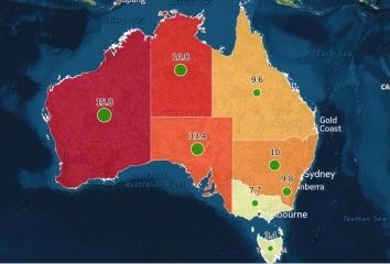
This map shows imprisonment rates for indigenous (Aboriginal and Torres Strait Islanders) vs.non-indigenous persons in Australian states in 2011.
This map was generated in QGIS and CartoDB by collating and analysing statistics for imprisonment of indigenous and non-indigenous persons within each State.
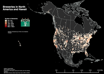
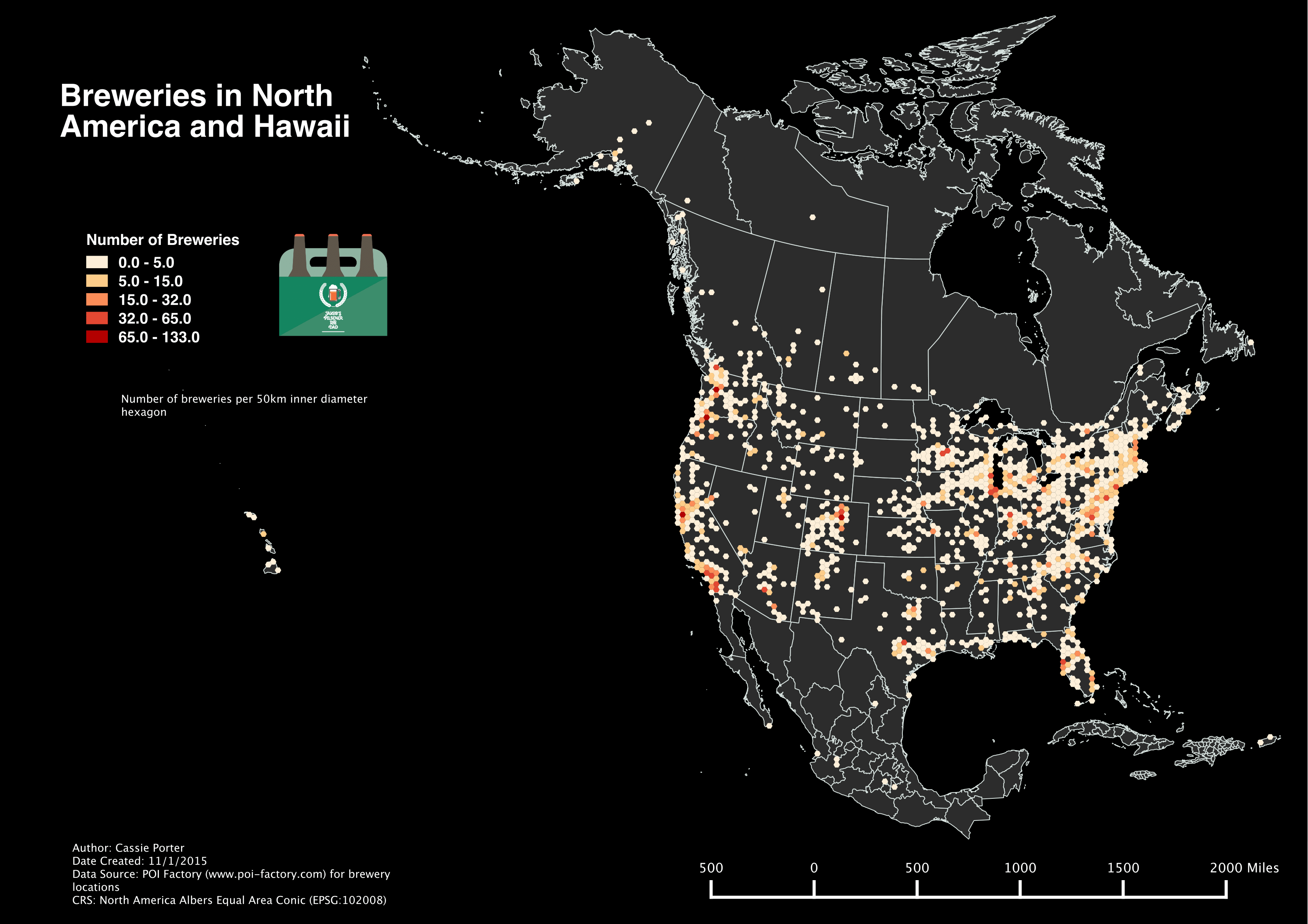
This hexbin map shows the number of breweries in North America and Hawaii .
This map was generated in QGIS by creating 50km hexbins based on brewery locations across North America and Hawaii.
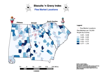
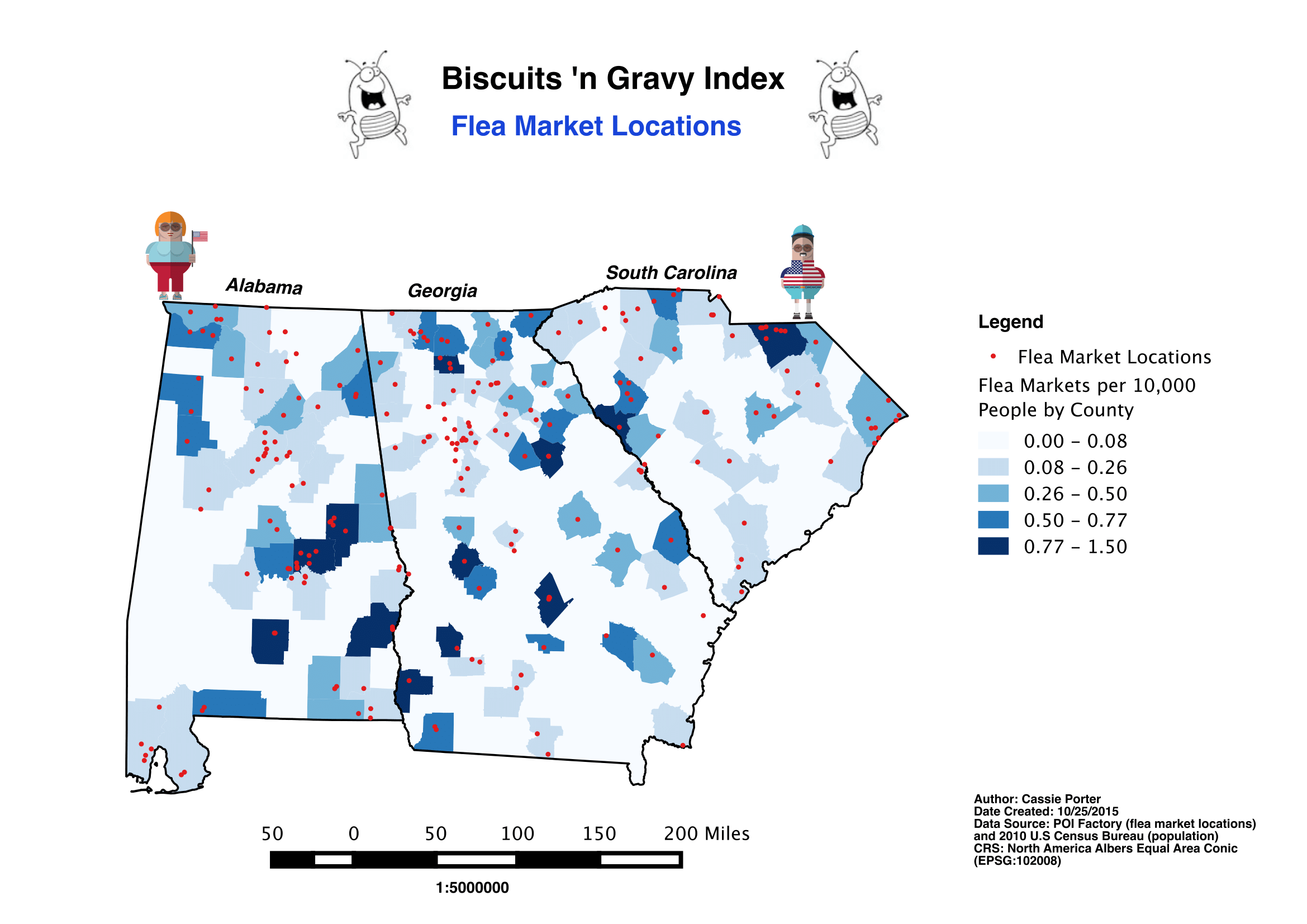
This map shows the number of flea markets per county population for Alabama, Georgia and South Carolina.
This map was generated in QGIS by geocoding flea market locations sourced from POI Factory and creating a choropleth map of the number of flea markets per 10,000 people for counties within the states of Alabama, Georgia and South Carolina.